
Colors are an important component of hand embroidery. It sets the tone for the entire piece of work. Bright colors add playfulness and cheerfulness, while dark shades can throw in sophistication. This page will explore quickly some elements of color and give ideas to select a palette for the project. The subject of colors is vast and I will put in every effort to make it simple, but relevant to you. First, let us understand ‘colors’.
The Color Wheel
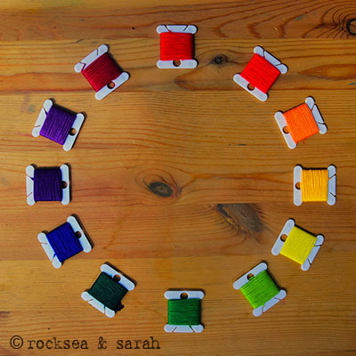 |
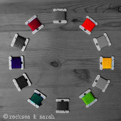
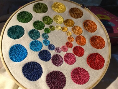
This is the color wheel where the colors are placed in a ‘rainbow’ pattern. All the following theories about color will be based on this color wheel.
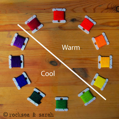
If you see, the color wheel is divided into warm and cool colors.
 |
Types of colors
Colors can be organized as primary, secondary, and tertiary colors in the Color Wheel.
|
1. Primary
|
2. Secondary
|
3. Tertiary
|
- Primary colors: Red, Yellow, and Blue.
- Secondary colors: Violet, Orange, Green.
- Tertiary colors: Violet-Red, Red-Orange, Orange-Yellow, Yellow-Green, Green-Blue, Blue-Violet
Forms of a color
Each color comes in four forms. These forms can communicate the mood of your work. Let’s try to understand it with the color- Red.
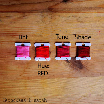 |
- Tint (Light): Add a degree of white to any color and you get a lighter shade. You can recognize the lighter shade of color when the colors appear softened and lightened. These colors are usually perceived as calming, soothing, loving, innocent, cherubic, Misty, soft, mellow, and sweet.
- Hue (Vivid): This is the true color in its purest essence. It is the hue and the true representation of the color, and its vibrancy forces your first attention to it. These colors are perceived as vibrant, passionate, alive, young, energetic, playful, happy, festive, and exciting.
- Tone (Muted): Add a degree of grey to the hue and you get a muted version that sets the tone of the color. It gives a worn-out or washed-out appearance. They are perceived as natural, organic, old, faded, rustic, worn, intellectual, boring, and dull.
- Shade (Dark): Add a degree of black to the hue to get a dark shade. Much like how different materials soaked in the water turn it into a dark shade. Such colors are perceived as mysterious, serious, complex, traditional, historic, sophisticated, rich, and elegant.
BUILD A PALETTE FOR YOUR HAND EMBROIDERY
Now that we have an idea of how colors work, we can get on to making a palette for our embroidery project. In other words, let us see how to apply what we understood to help us decide on the colors for an embroidery project. Remember that whatever combination of colors you choose, you will take into consideration all 4 forms of each color. This does not mean that you will use all the tints, hues, tones, and shades of the colors you have selected, but just that you have the option to select the combinations out of it. Your background or fabric color will also affect the combination you would pick.
1. Use the color theory or the color wheel
|
1. Monochromatic
|
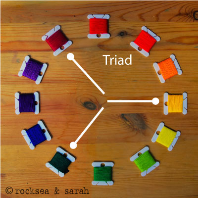
2. Triad
|
|
|
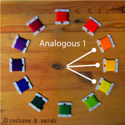
3. Analogous -1
|
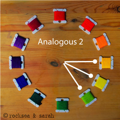
4. Analogous -2
|
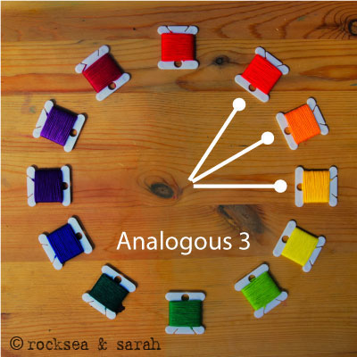
5. Analogous -3
|
|
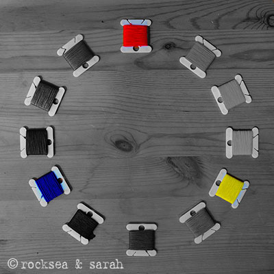
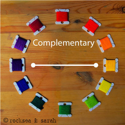
6. Complementary
|
7. Double Comp
|
8. Split Comp
|
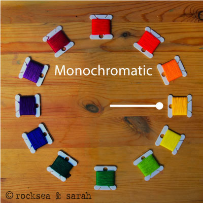

- Monochromatic: Choosing a monochromatic color for the project means that you will be playing with the tints, hue, tones, and shade of just one color in the same project.
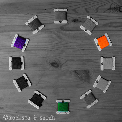
- Triad: These colors are separated by three colors between them. You can pick from a combination of the tints, hues, tones, and shades of these three colors.
- Analogous: These colors are neighbors and give a very harmonious combination of colors. Use a combination of the tints, hues, tones, and shades of these related colors.
- Complementary: These colors are on opposite sides of the color wheel, and they intensify each other. Various combinations using the tints, hues, tones, shades of these colors can be made to set the mood of the project.
2. Use your experience and memories
Think of the colors that come to your mind as you think of a subject. For instance, think of the beach. What colors does it remind you of? Most of us think of blue and white (for the ocean). Some might think of more tropical colors like red, blue, and yellow too if they have more experience in tropical beaches with lots of colorful beachwear!
 |
Now try it out with something more abstract like Mother’s Day. What elements does it remind you of? What colors float into your mind? Using experience and memories offers a chance for you to bring out your unique thoughts and imagination to life, and tell your own story through your stitching.
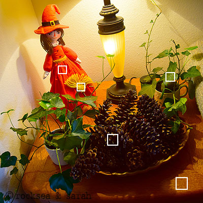
3. Use your surroundings
Look around you. Observe colors. Does any combination catch your fancy?
 |
 |
This is a corner of my living room that I love for its colors. I picked the colors that catch my eyes from it. I can now form the tints, hues, tones, and shades for each of these 5 colors and try to combine them in my best possible way.
Sometimes, deciding on a palette can take time, and it is okay. These methods will help you to make the selection of colors easier and faster. With more practice and experience, you will only get better. Play with the colors fearlessly and develop your own style!
Related Projects
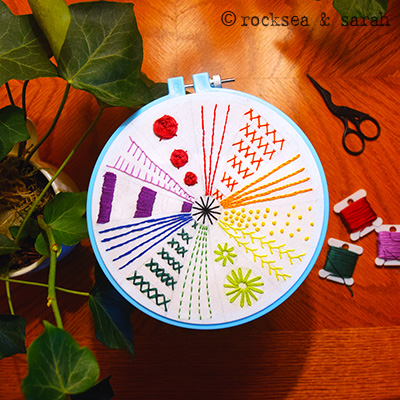
Check out this Color Wheel Project that applies the 12 Basic Stitches.
Learn more about Hand Embroidery along with 306 stitches from our 600-page eBook!
 Sarah has been researching and sharing hand embroidery lessons for over 18 years, making it accessible to everyone around the globe.


I am trying to form an embroidery floss color palette for old fashioned valentine and Christmas card colors-Without taking too much of your time – would you know the colors that would represent those beautiful – fun loving colors? I can’t find a true retro palette. Thank you – if you don’t know – no one would. You are the most talented in all areas of embroidery as I can see. Thank you for so much.
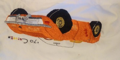
Beautiful work. Here is a pillowcase I did for my nephew
Hi Sheryl,
This is wonderful! Love your patience to stitch similar patterns on both sides. Thank you so much for sharing it here!
I did a colour wheel and wanted to read more about it and I found you. It was very useful. Thank you so much.
Hi Lumbini,
What a splendid piece of work! Gorgeously made. Love the colors and the texture.
Thank you for sharing it in this space. ❤️
Hi there! Thank you for this helpful article. Would you mind recommending me a color palette that is autumn- and/or spring-like colors (smthng like the pics, they’re from Pinterest)? Can you also include their color no., thank you! There are lots of colors with different shades out there and it’s just too overwhelming for me. I just couldn’t decide which color I should get. I’m a beginner btw.
Hi Mimi,
The autumn color palettes are beautiful. I would recommend you use Pinterest to search for color palettes of the autumn theme. Keep the fabric color in mind as you do so. Some of them even give the thread color codes. I hope you will find a good one. 🙂
I loved your corner! tks so much for the idea!
Awesome. 🙂
Oi Sarah,
Fiquei encantada e muito agradecida com suas explicações, mas tenho muita dificuldade na escolha da paleta de cores para iniciar um bordado à mão!
Por favor, você poderia fornecer, a cor # dos fios na roda de cores da marca Anchor?
Obrigada!!
Hi Magali,
Try this:
Colors – Anchor (DMC)
1. Red – 47 (321)
2. Vermilion – 330 (947)
3. Orange -, 316 (740)
4. Amber – 298 (972)
5. Yellow – 289 (307)
6. Chartreuse Green – 256 (704)
7. Green – 257 (905)
8. Jade – 246 (986)
9. Blue – 133 (796)
10. Purple – 119 (333)
11. Violet – 109 (209)
12. Magenta – 94 (917)
Love,
Sarah
Merci beaucoup pour toutes ces explications. J”ai toujours du mal à assortir les couleurs, j’essaierai votre méthode. Bonne soirée.
Thank you, Marijo! So glad to know. 🙂
Excellent explanation of colour
for the creation of a pallette.
Thank you.
Thank you, Giselle. 😊
Good examples, thank you for your explanation
Happy that you found it helpful, Margaret. 💕
I recently found you. Is it possible you can provide the color # dmc or any other brand you use? Beautiful explanation. I am starting from zero?
Hi Mavi, I use Anchor brand of threads. Do you want me to provide you with the color # of the threads in the color wheel?
It will be awesome! Thanks in advance.
wow, thank you. I am a novice in colour theory and struggle to select my own colour palettes for embroidery, I have tried reading books but get overwhelmed. This is a manageable amount of information to get familiar with. Thanks again
Thank you, Dragica. I am happy that you found this information useful and just enough. Hope this sets you in the right direction to finding good color combinations. 🙂
Neatly explained.I just love the way you had done with pictures. Thanks for sharing
Thank you, Jayagouri! ❤️
I have to say that this is a fabulously informative site and I appreciate all the work that goes into this production. Thank You.
Thanks, Kathleen.🌸☺️
So very helpful!
Thank you.
Thanks, Judith.🙂
Sarah, this post is wonderful.
You have provided a great deal of information, and you’ve done it without adding any extraneous words. I love it. It’s like the summary of a book – without having to read the whole book!
Thank you.
Thanks akaGaga.😘
I had always wondered on how to come up with a beautiful color palette for hand embroidery projects, especially when I was a beginner. I am hoping this post will shed some light in this area for all beginners who struggle like I had!
I recently found you. Is it possible you can provide the color # dmc or any other brand you use? Beautiful explanation. I am starting from zero?